Shades of Blue (in Carnival Glass)
by the Hooked on Carnival Team
We were asked to put together a document that would assist us in being able to more correctly identify colors of pieces sold at auction, so this is the result of that request.
First, the caveats:
In the carnival glass collecting community, through the years colors have been assigned that do NOT match those color names in other venues (color wheel, gemstone, etc.) but that are rather locked in place and will be called something specific in our hobby. [As an example, Sapphire Blue in a gemstone may look more Blue or even closer to Violet Blue than the color we have assigned in carnival glass collecting.]
Second, colors can look different on each person’s device or monitor (as well as with a different photo background).
Third – some colors seem to be very much manufacturer specific (i.e. Violet Blue is, to date, only found on Imperial patterns).
Fourth – when we started collecting some 35 years ago, almost any light blue base with an opalescent edge was thrown into the ‘Aqua Opalescent’ classification, and many of them, using this document, will not be correct. We will attempt to sort them out over a period of time.
And lastly, because often you don’t have something to compare, it is exceedingly difficult to remain consistent. We do our best to stay the course, but there will always be points of contention.
These are the blue shades currently in the Hooked on Carnival database as of July 2021.
Aqua (Sits between green and blue in the color wheel.)

Aqua/Marigold Overlay (Sits between green and blue in the color wheel – the glass has a marigold iridescence that may cover almost the entire piece – usually leaving the feet or base as the only real way to tell the color.)
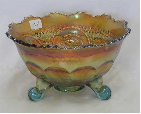
Aqua Opal (Aqua Opalescent – Aqua base color with white or light blue, milky edge or tips). In carnival glass, MANY pieces that are actually a different shade of blue (but with an opal edge) are classified as Aqua Opal. Incorrect, BUT because there is no ‘color wheel’ for us, that is the term.
The Corn Vase below looks a true Aqua Opal, the Tree Trunk vases run the gamut from what looks like Aqua Opal to Blue Opal or Sapphire Blue Opal, but they were all classified as Aqua Opal.)
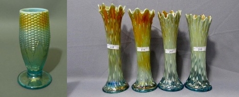
You will need to go by the pattern as much as by the actual color.
Aqua Opal Butterscotch (Aqua Base color with white or light blue, milky edge or tips AND has a predominantly marigold/orangey iridescence.)
The top two left Tree Trunk vases could be classified as Aqua Opal Butterscotch. The Corn Vase has some marigold/orangey on the top 1/3 but would probably not be as likely to be called Butterscotch.
Aqua Opal Pastel (Aqua Base color with white or light blue, milky edge or tips AND has a predominantly light iridescence with blues/pinks/yellows– very easy to see the base glass color.)
The same issue is seen with this color as the other two variations of Aqua Opal – often the actual blue tone in the base is NOT aqua, BUT with many patterns, no matter the actual shade of blue, it will be reported as Aqua Opal Pastel. This phenomenon is usually pattern based.
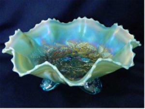
Aquamarine (see Ice Blue for Carnival references -Described as a mixture of green, cyan and blue, this color is strictly used by Hooked for Stretch Glass at this time. It is what carnival collectors usually call Ice Blue (and will typically be frosty). The definition simply says, ‘a very pale blue color’.)
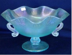
Blue (A primary color, typically used when the shade is not mixed with green/red). Fenton originally called this Royal Blue, sometimes people call it Cobalt Blue.

Blue Jade (Opaque to translucent light robin’s egg-like blue or blue-green glass – at this time, specific only to Northwood Stretch glass patterns – and the Stretch Glass collectors call it Jade Blue)
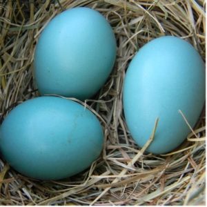

Blue Milk Glass (Opaque to translucent light blue (or blue-green) glass – specific only to Westmoreland patterns).

Blue Opal (Blue base glass with milky white or milky blue opal tips or edges.) The range of different blue colors that make up this category are all the way across the color scale. Often the opal is so heavy that only the base is actually blue and the opal is a light blue opaque color. We currently have 22 patterns in the HoC database in this color – the majority are Westmoreland. Those that are NOT Westmoreland (like Fenton Holly) tend to be a very Blue base with light opal on the edges (and may not have been production colors).

Blue Slag (Opaque marbled Blue base glass – can be called Sorbini) NOT the same as a slag effect, where the base glass has streaks of white in the clear base color – this is actually marbled. Only 10 or less pieces of this reported in Carnival Glass. You have to see the base to identify the marbling best.
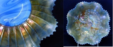
Blue Swirl (Opaque marbleized Imperial Art Glass – Free Hand or Lead Lustre pieces are found with this exterior and an iridized interior). The shade of blue is not necessarily the same on all pieces.
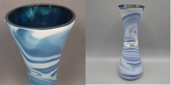
Celeste Blue (A light to medium blue with a pastel iridescence (you can see the base color thru the iridescence, there is NO overlay)). The iridescence quite often will be ‘stretchy’. It can be like a robin’s egg blue; we were originally taught that Dugan/Diamond and Fenton were the two manufacturers that made Celeste Blue. [NOTE: The base color is very similar on some Celeste Blue pieces to the Northwood Sapphire Blue (with the pastel iridescence), so the two colors are sometimes interchanged.]

*Electric Blue (Blue base glass – (see Blue for reference) BUT this color in Carnival Glass is actually more about the iridescence on that blue base glass. The iridescence typically is predominantly Blue with Red highlights (and can have gold or green in addition to those). Said to look like it’s ‘lit’, it should be very vivid.)

Ice Blue (See Aquamarine for Stretch Glass reference – A very pale blue color with pastel iridescence (may have some green-light blue tones and may look ‘frosty’).)

Ice Blue Opal (A very pale blue color with pastel iridescence (may have a ‘frosty’ look) and milky white or milky light blue edges or tips.)

Pastel Cobalt Blue (Cobalt blue with pastel iridescence (no overlay).)
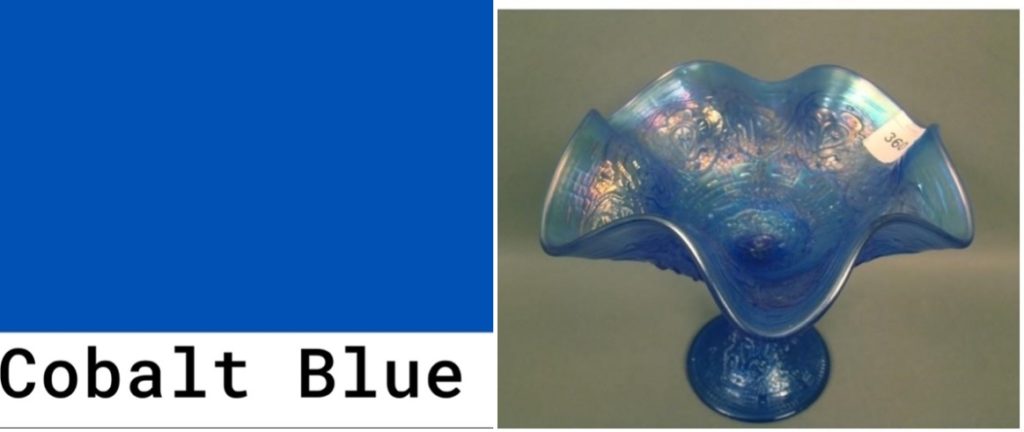
Persian Blue (Translucent milky robin’s egg or light blue, always with a Marigold Overlay- [production color for 4 Fenton patterns].)

Persian Blue Opal (To date, all of the items under this color category are Northwood pieces that have a milky light blue base glass and opal edges or tips.)

Powder Blue (Described as a ‘pale grayish-blue’, this color is most often seen with the Marigold Overlay (see below), very few pieces of true Powder Blue). It could be described as a ‘washed-out’ blue color.)
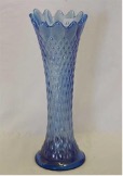
Powder Blue Opal (These would be a ‘pale grayish-blue’ with opal edges – very few classified as this color, at this time only a few Northwood patterns exist in the Hooked on Carnival database.)
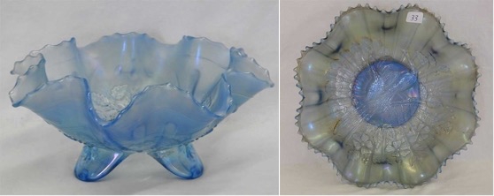
Powder Blue/Marigold Overlay (This is, again, pale grayish-blue, but the marigold iridescence usually covers it so that the only way you see it is by turning the piece over and looking at the collar/feet. The majority of pieces in this color category are Fenton.)

Renninger Blue (A blue shade that looks to us like Pacific Blue – a shade of cyan with 11% red, 66% green and 79% blue. This is what the internet shows as Pacific Blue:

And here are examples from the database:

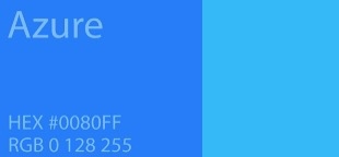
Sapphire Blue (Described to us as ‘Windex Blue’, Sapphire was originally considered to be a Northwood Color (Dugan & Fenton called it Celeste) and it was only used to describe the pieces with a pastel iridescence.) This is now occasionally interchanged with Celeste Blue.
It could best be compared to an Azure blue or Deep Sky blue like these from a color chart (depending on the pattern):
Here are some carnival glass database examples:

Sapphire Blue/Marigold Overlay (Same as above BUT with a marigold iridescence covering much of the base glass color (NOT pastel iridescence)

Smokey Blue (Very close to powder blue but with a smokey gray look. It should probably be noted that the iridescence is sometimes what is making the ‘smokey’ part.)
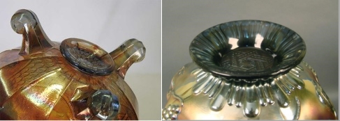
Teal (Defined as a deep blue-green color, named for the colored area around the eye of the bird). Quite honestly, we would simply go with the pattern’s availability for this one – most things we call Teal in CG appear to be either Turquoise, Aqua or Aquamarine (much more blue than green). Also, typically teal will have a pastel iridescence (like many Imperial patterns that are classified as this color.)

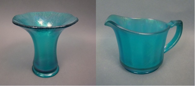
Teal/Marigold Overlay (Should be the deep blue-green color with a marigold iridescence making it difficult to see the base glass color in most cases. On the vase below, look at the color far right where no iridescence is affecting the identification.)
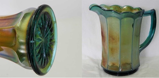
Violet Blue (A deep blue – similar to Ultramarine on this color chart picture– violet is described as halfway between blue and purple.) Many carnival pieces are heavily iridized back and front, so difficult to get the color correctly identified. At this time, all pieces identified as this shade are Imperial patterns.)

